Marketing + Web
Part I: The Alphabet Soup of Marketing Terminology: Websites
November 28, 2017

When you are in the depths of a marketing overhaul website, brand, or even a film project— terms often make as much sense as alphabet soup.
We thought an introduction to some of the terms marketing, design, and film consultants use will reduce the stress you may be feeling during your next marketing endeavor. Wherever possible, we will show you what each element is too.
ProTip: Print this blog off and hide it in your top desk drawer and then the next time your marketing department calls, you can you can decipher that code they seem to be speaking over the phone.
Website Design & Development
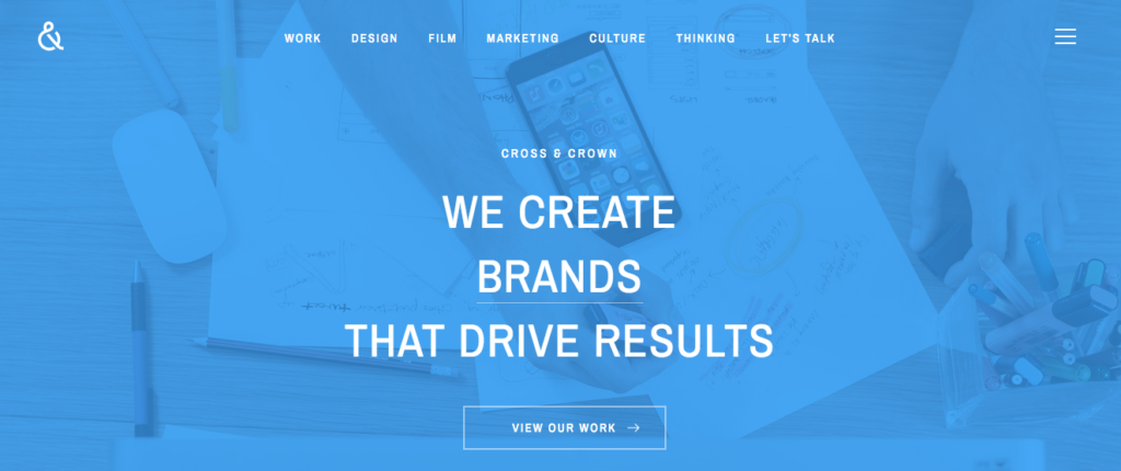
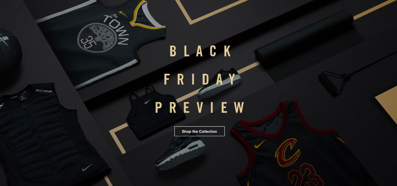
Hero Layout
Leadpages says “the hero layout is based around a single content section that takes up the first fold of a page with one clear goal. It has the feeling of a superhero signal in the sky. It’s big, stationary and grandiose. It takes up your entire screen, yet feels simplistic at first glance.”
This is our hero layout.
Above the fold
Similar to a newspaper where the most important information is listed above the fold, a website’s “fold” is considered the opening, top panel of information on a website, prior to a user scrolling.
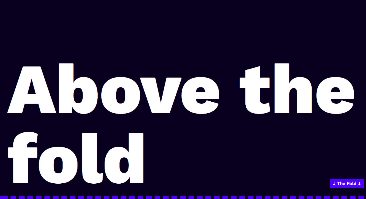
If you research articles on “Above the Fold” you’ll find technical experts disagreeing on whether or not holding onto this design trend is valuable in 2017, how much time people actually spend above the fold now that responsive design is standard, and what is the best use of that space.
Our general recommendation is to make sure that when users arrive at your site on desktop, mobile, or tablet, the information that you most want them to see is listed in the top panel.
Slider
A slider is often used in the top section of a website, above the fold. Mini sliders can be used in a variety of areas on your website, but the most popular remains the top panel of a site.
We used a slider on our Sunnyway Foods site because we wanted to showcase the different food items that were available each week on special.
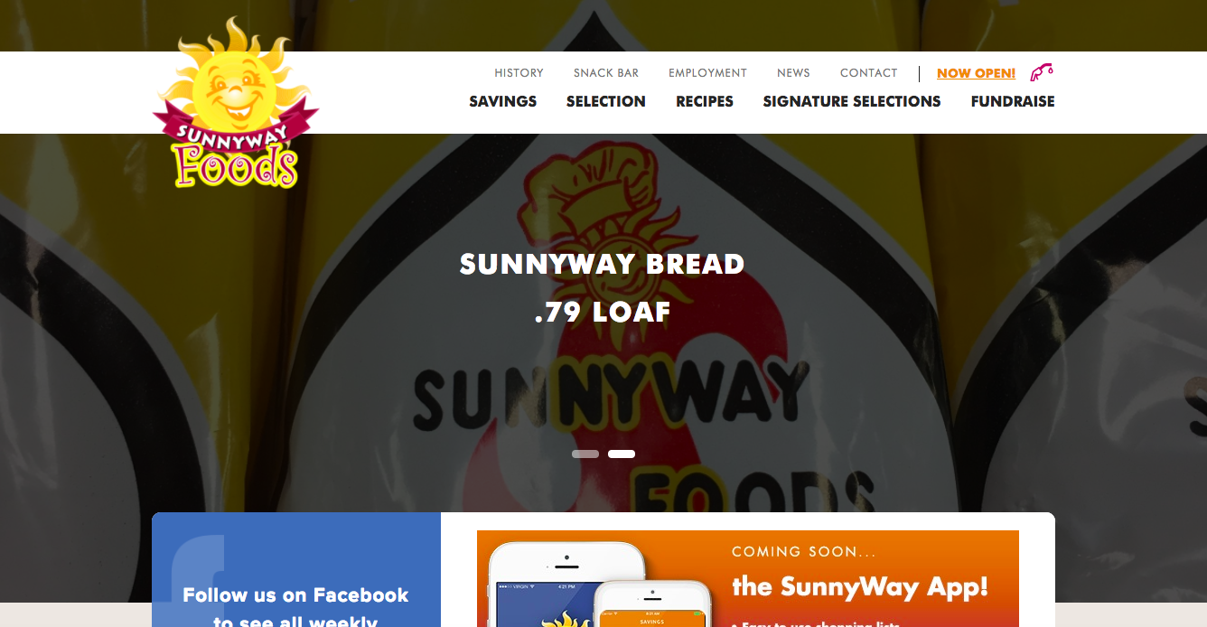
This design trend became popularized because it allowed companies to display multiple pieces of important information that the user could view before scrolling to other sections of the website. The problem with a slider, however, became user focus. When you have 3-5 pieces of the “most important” information displayed above the fold on your website, what should the user focus on? When the slider topics aren’t—in any way—connected, it becomes, well, a hot mess.
The skinny on sliders? Use them sparingly and make sure all content is related. Or even better, use a Hero Layout and change your key messages regularly to keep your users engaged.
Panel
Websites today are often designed in panels that display as a user scrolls down. Each of these panels have information that is presented in “groups” of digestible information.
Nike does a great job of separating different pieces of information into panels.
Panel 1
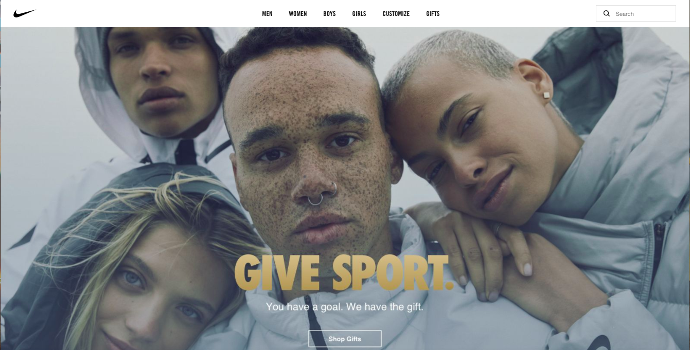
Panel 2

Panel 3
Panels have become popular because of a marketing trend towards single-page web design that allows marketers to control their message more closely (we talked about that in our blog Friends Don’t Let Friends Click). Panels also follow best practices of instructional design where presenters are encouraged to serve up information in bite-sized bits.
Responsive
In the web development world, responsive means that websites will adapt to any size screen you are viewing them on (e.g., mobile, desktop, tablet). Smashing Magazine says:
Responsive Web design is the approach that suggests that design and development should respond to the user’s behavior and environment based on screen size, platform and orientation. Responsive practice consists of a mix of flexible grids and layouts, images and an intelligent use of CSS media queries. As the user switches from their laptop to iPad, the website should automatically switch to accommodate for resolution, image size and scripting abilities. In other words, the website should have the technology to automatically respond to the user’s preferences. This would eliminate the need for a different design and development phase for each new gadget on the market.
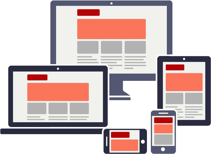
Our team takes responsive design a step further. We believe that websites should “respond” to not only the technical requirements of the device you are using, but also the functional requests of a user. For example, a user researching a restaurant on a desktop may want access to information such as menus, location, pictures of dishes or decor, reservation system, and reviews. This user may also want to compare a variety of restaurants next to each other to make a choice on where to eat that weekend. The size of a desktop’s responsive design allows for more extensive information to be presented to the user.
[inf_infusionsoft_inline optin_id=optin_14]
Conversely, that same user, rushing out the door at lunch before her next meeting simply wants to know the simplest way to reach the restaurant, and if possible, a phone number to call in her order. So directions and a phone number need to be readily accessible on her mobile device.
Bentobox gives a great example of the scenario above on mobile.

Content Management System (CMS)
Your CMS manages all of the digital content for your website. It is a computer application that supports the creation and modification of digital content. It typically supports multiple users in a collaborative environment.
CMS systems for websites allow multiple users to access an admin panel and manipulate website content. The primary functions of a CMS include the following:
- indexing
- search and retrieval
- format management
- revision control and audit logs to track changes
- Publishing
- Admin panel
- Design templates (often these are customizable)
Examples of popular CMS’ are discussed in our blog Pros and Cons of the Top 5 Website Builders.
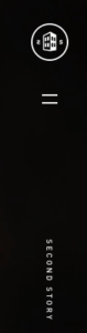
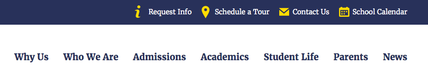
Navigation
Navigation is how you get from point A to point B on a website. Navigation bars used to only be positioned at the top or bottom of a website, but now you can find them in any type of structure like the examples that follow.
Standard top navigation
Hamburger menu that displays from the side
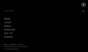
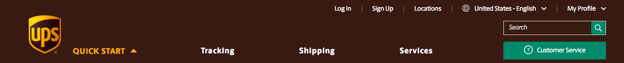
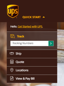
Secondary Navigation
Secondary navigation includes the items that fall out from the primary navigation. They can be listed as separate navigation bars or elements, or cascade from the menu items themselves.
In this example the top bar is the secondary navigation.
In this example, UPS has primary and secondary navigation (top bar) as well as a quickstart tertiary navigation along the side.
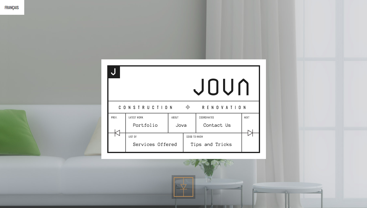
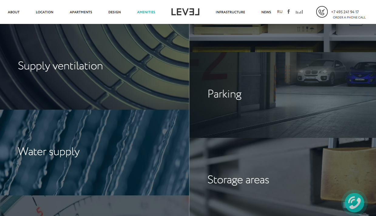
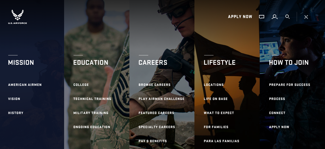
Non-traditional Navigation
There are even unique navigation structures like the following (the bottom two won Webby awards in 2017). Click on the pictures to see the navigation in action!
Coloured Lines Telephony

Jova
Level
GE

Airforce
PHP, Hypertext Markup Language (HTML), and CSS
PHP is an acronym for PHP: Hypertext Preprocessor. It is an open source general-purpose scripting language that is especially suited for web development and can be embedded into HTML. It can be used on all major operating systems and a wide range of databases. With PHP you also have the flexibility of server choice. PHP is primarily a server-side scripting language. PHP scripts execute on the back-end, manipulating data on the server and outputting content to a webpage based on a user’s inputs.

Think of PHP as the “engine” that runs your website.
HTML is a “markup language.” Hypertext is simply a way of navigating across the web. When you click on a link online, it takes you to the next page or anchor. Hypertext is not linear, you can click on a link and go anywhere it directs you on the internet. Markups are a collection of tags that tell the text what to do. Italicize, bold, and strikeout are just a few of the tags. Markups also include
HTML describes the structure of Web pages using markups. HTML elements are the building blocks of HTML pages. HTML elements are represented by tags and HTML tags label pieces of content such as “heading,” “paragraph,” “table,” and so on and tell the computer what to do with certain pieces of text or content. Browsers do not display the HTML tags, but use them to render the content of the page.
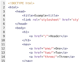
HTML is the foundation and structure of all web development and used primarily in front-end web development.
Cascading Style Sheets (CSS) describe how HTML elements are to be displayed on screen, paper, or in other media. CSS handles the how a webpage looks and feels.
CSS allows you to control colors, font styles, how a paragraph is presented (in a box, spacing between lines, alignment), as well as column layout, background images or colors, and page layouts. Style sheets allow content to be optimized for more than one type of device.
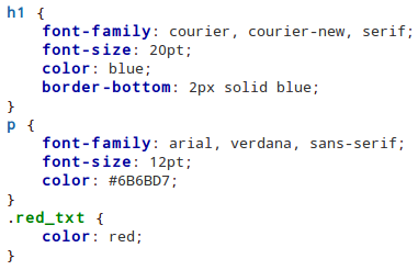
CSS is the (visual and aural) layout on pages and elements on a variety of devices.
This will give you a good start on web terminology. Feel free to email or write in the comments any other terms you want us to explore and we’ll update our lists for the next few segments of the series. Come back and see our Marketing, Film, Branding, and part II of Websites terminology blogs.
Note: Some of the web terms used in marketing such as SEO, SEM, and Analytics will be discussed in our next blog post about Marketing Terms. We will also discuss Website hosting and other web terms in Part V of this series.
About Cross & Crown
Cross & Crown is a team of creatives who are passionate about solving problems through design and technology, taking what is there and making it better. Based in Chambersburg, PA, we strive to help educate, advocate, and thrive in a digital world.
Our Culture