Marketing + Web
Your Guide to Great Calls to Action
August 13, 2019

No marketing campaign is complete without a call-to-action (CTA). In a few words, a good call to action is clear, concise and easy to follow and it delivers on what was promised to customers. But who wants to settle for good?
While a bad CTA can easily destroy a campaign in mere seconds, a great one effectively guides your customers through the buyer’s journey and is the difference between content that fails and content that converts.
Ready to create CTAs that your customers can’t help but click? We’ll break down the key elements to consider while creating a call-to-action.
Use Contrasting Colors
If you’re building a new landing page or sales funnel, the easiest way to guide your customers to where you want them is to do it visually. On a mostly neutral design, a CTA button in a bright color jumps off the page and leads customers through a natural flow of progression. In this example from Evernote, the bright green instantly catches your attention.
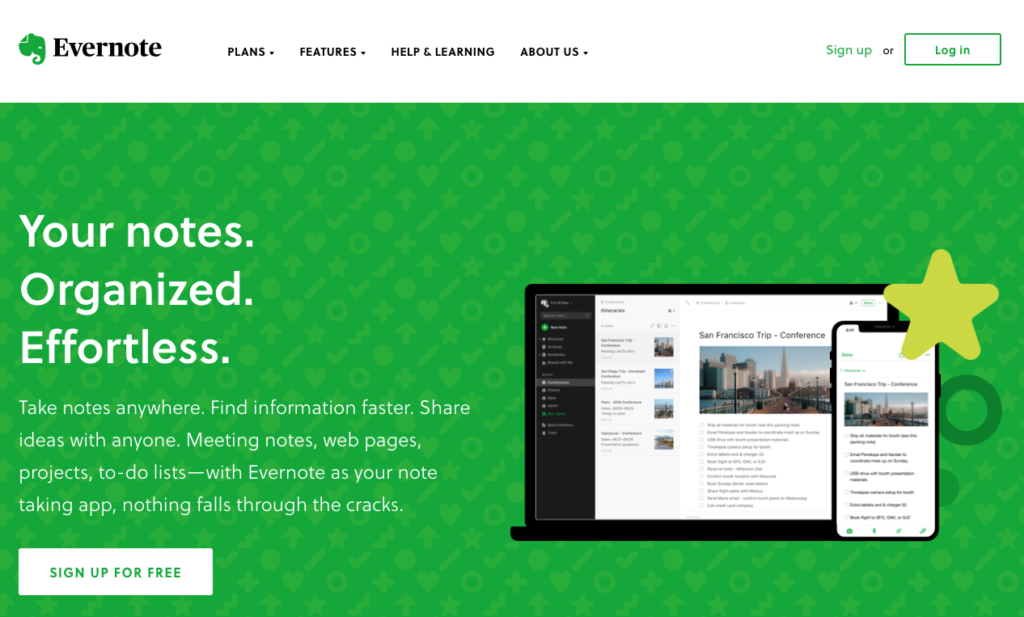
This Evernote CTA button also matches the color of their logo, reinforcing their branding and allowing for site visitors to easily interpret it as “Sign up for Evernote.”
Beyond contrasting colors, this CTA stands out because of its minimalist design in comparison to the busy imagery on the right-hand side of the page. The biggest takeaway to consider is… How can you create enough contrast to have your CTA immediately stand out on the page?
Pop-Ups
Have something that you really want to get eyes on? Consider a pop-up on your website. Pop-ups typically work best for signing up new email subscribers, first-time visitor offers (e.g. free shipping on your first order), or a really great offer. There a few important elements to keep in mind when creating a CTA pop-up:
1. Use Them Sparingly
Notice how we specified a really great offer? When pop-ups are overused, visitors may start avoiding your site for fear of yet another pop-up, well, popping up and hindering from completing their buyer’s journey. Pop-ups are best reserved for a “can’t miss” offer or a one-time newsletter sign-up, meaning once a visitor’s signed up for your emails, they won’t see that pop-up again.
2. Timing
A pop-up that shows up too soon may leave visitors unsure of what your company even does. A pop-up that shows up too lates runs the risk of visitors leaving before seeing the CTA. Test different time triggers to determine what leads to the most conversions.
3. Pop-up Types
From the square pop-up that appears in the middle of the page to a banner that slides in, there are varying types of pop-up CTAs. The former demands attention and works great for an offer your visitors can’t refuse while the latter is less obtrusive—visitors can still scroll through your site while the pop-up “lives” at the bottom or in a corner. Consider your goal of your CTA, your audience, and more to determine which best suits your needs!
COPYWRITING
Personalize to Your Brand
Have brand-specific jargon? Words your company frequently uses? Think of how you can incorporate messaging that’s personalized to your brand rather than a standard “Sign Up Now” or “Join Now” CTA. This CTA from Lyft utilizes car lingo that’s playful enough to show off the brand personality and motivate visitors to follow through, all while easily differentiating the rider/driver CTAs.
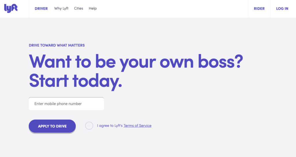
As seen in this example from Lyft, the best CTA’s focus on brevity, but copywriting isn’t limited to the CTA itself! Here, “Take the wheel” isn’t the CTA button but plays a huge role in conveying the intention
Play Up The “Benefit”
If you’re collecting email addresses or requesting payment, are you actually providing value in exchange? If your buyer’s journey includes multiple CTAs along the way, don’t lose visitors early on by over-promising and under-delivering.
Take time to think through the value your visitors gain by completing your CTA. Will they save money or time? Are they getting access to an exclusive product? From there, capitalize on the benefit to write a CTA that’s specific to your offering and more encouraging than a simple “Try Now.”
STRATEGY
Create a Sense of Urgency
So you have a great design and great copy, but you want to take your CTA to the next level and really convert… Create a sense of urgency! Have you ever been trying to decide whether or not to splurge on an item only to have the salesperson let you know it’s the last one left? Decision made—you have to have it.
Apply the same tactic to your CTA strategy. Knowing an offer is ending soon or that there are only a limited number of spots available instinctually motivates visitors to follow through right there and then.
Run A/B Tests Consistently
No CTA should go untested! CTA strategy goes well beyond great design and copywriting. The surest way to consistently create great calls-to-action is to use your data to support your design. Test different color buttons, various wording, and more to learn what works best for your audience.
CALL CROSS & CROWN
Reach Out to The Pros
Does all this CTA talk leave your head spinning? Call in the pros! We can build your sales pages and write CTAs that will convert. Let’s chat!
About Cross & Crown
Cross & Crown is a team of creatives who are passionate about solving problems through design and technology, taking what is there and making it better. Based in Chambersburg, PA, we strive to help educate, advocate, and thrive in a digital world.
Our Culture