Case Study + Web
Case Study: Here’s Why Web Design Can Make or Break the Buyer’s Journey
January 12, 2021
3 minutes

In order for your marketing strategy to be successful, you must have a clear message and a well-designed website. Messaging is important—and you’ve got to get that part right—but it’s only part of the process. Your website must showcase your brand message in a way that makes sense to your potential customers. Otherwise, they will get confused and leave your site without taking the next step.
This is the place where we see a lot of marketing get stuck. You have a powerful message lost on a confusing website. The content is there, it’s just not organized in a way that’s intuitive for potential customers. Many times when a business has a lot of web content, it’s organized according to internal structures and processes that are intuitive to the people who work there, but not to people outside of the organization.
In this case study, we share some similar challenges our client, Elite Worldwide, was facing and the solutions we discovered to help their business thrive.
The Challenge
Elite Worldwide helps auto repair shop owners “take their shop to the next level” through coaching and peer groups, advisor training, and specialized events. Elite provides top-notch training and access to industry experts with strong appeal to business owners in the automotive industry. However, their website fell short in reflecting their strong brand. They needed our help designing a website that’s easy for end-users to navigate and that highlights the premium services they offer.
Truthfully, Elite already had a ton of great content. Our main task was to design a site that showcased the brand, boosted lead generation, and improved ecommerce through intuitive navigation and information architecture. We wanted to create something that was easy to understand, showcased the quality of their products, and effectively funneled people towards using their services.
Here are some steps we took to give their website the necessary updates to better reflect who Elite is as a company:
- Cleaned up the design and presentation of information so that the look and feel was clean and organized.
- Used custom professional photography, videos, and customer testimonials so their brand made a personal connection with potential customers.
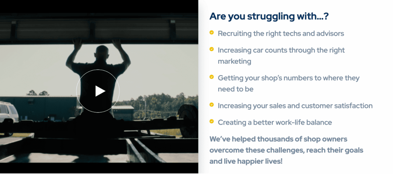
- Stated the problems and pain points their potential customers may be experiencing near the top of the page so they could quickly see how Elite can help.
- Emphasized responsive design elements so their website looks equally great on desktops, tablets, and mobile devices.
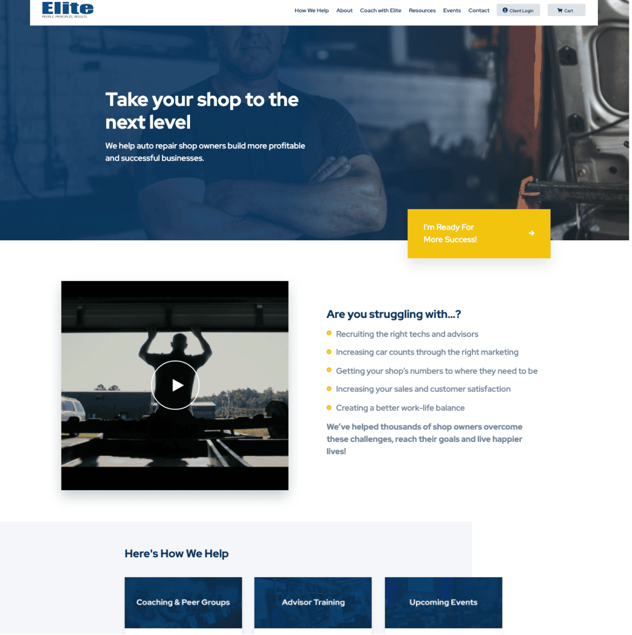
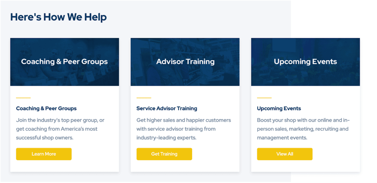
Separating the three primary services areas into specific sections helps users quickly identify the types of services offered with clear calls to action to make it easy to take the next step.
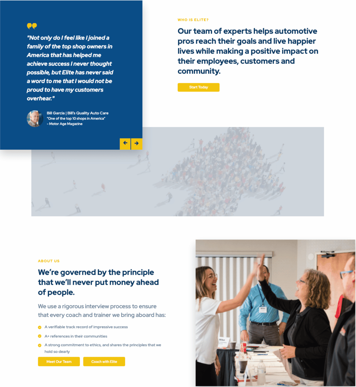
Customer testimonials and quick clips of “about us” type of information give users a quick understanding of the purpose Elite is striving to fulfill.
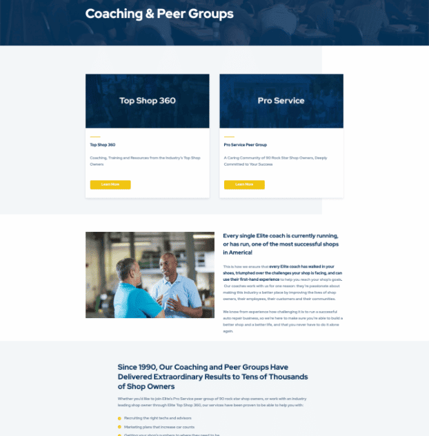
Beyond the homepage, we built out details of each service including peer groups, training, and presentations of industry-leading coaches available to partner with clients. Integrating video and testimonials throughout builds authority and trust as leads move through the buyer’s journey.
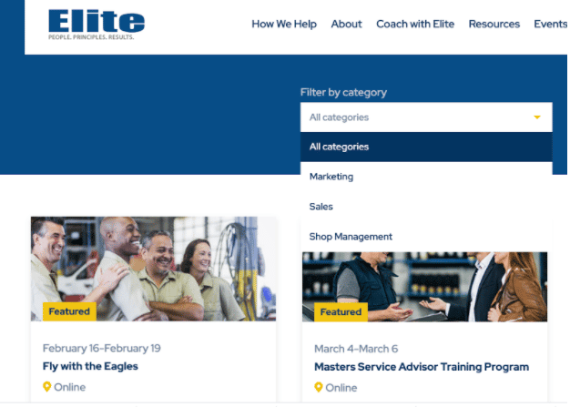
Events are organized with scanning in mind, making it easy to find what you need quickly, as well as a tool to filter content by category.
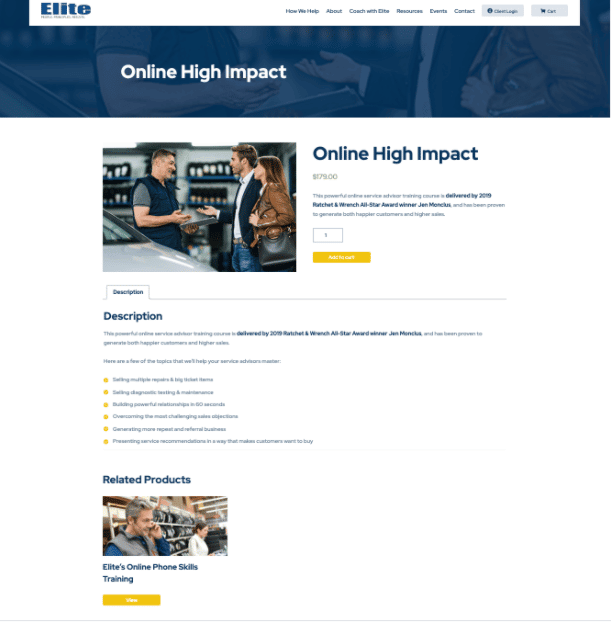
In addition to information architecture and design, we built a custom ecommerce solution with the ability to purchase specific programs and register for events. The interface is clean and easy to use across all platforms, with integrated forms, descriptions, and related products. This solution is working well for digital content, as well as event registration. There’s also the functionality to allow visitors to “become a member” giving them access to premium training opportunities and bonus content.
The Takeaway
Elite Worldwide had all the components of a winning brand, they just needed our help presenting their impressive content in a user-friendly way. With a fresh design, it’s now easier for customers to interact with Elite’s content and engage with their services. When designing a website, it’s important to put yourself in your customer’s shoes. Consider what your prospects are thinking and feeling, what their pain points may be, and what kinds of questions they are asking. This will help you organize your website in a way that makes it easy for prospects to become clients.
If your website isn’t producing the results you’re looking for, it could be that your content needs a reorg. We would love to help you evaluate your website design and suggest changes that could help you win more customers. Let us know how we can help!

