

Many small and medium-sized businesses assume their landing pages have a traffic problem, when in reality, they often have a conversion problem. A company can spend thousands of dollars on digital advertising, email campaigns, social media promotion, and SEO to drive visitors to a landing page. But if that page fails to communicate value, establish trust, or guide users toward a clear action, traffic alone won’t generate results.
That’s why landing page optimization has become one of the highest-impact opportunities for organizations looking to improve marketing performance without increasing their advertising spend.
Whether your goal is generating leads, scheduling consultations, collecting donations, recruiting employees, or selling software subscriptions, a landing page should function as a focused conversion tool. This practical landing page teardown outlines a repeatable landing page audit process that small and medium-sized businesses can use to identify weaknesses, improve user experience, and increase conversions.
What Is Landing Page Optimization?
Before diving into the audit process, it’s important to understand the meaning of landing page optimization. Landing page optimization is the process of improving a web page’s ability to convert visitors into a desired action.
That action might include:
- Filling out a form
- Scheduling a consultation
- Requesting a quote
- Downloading a resource
- Registering for an event
- Starting a free trial
- Making a donation
Landing page conversion optimization focuses on reducing friction, improving clarity, and increasing the likelihood that visitors take the next step. The goal is to turn visitors into leads, customers, applicants, donors, or subscribers.
Step 1: Audit the Hero Section and Above-the-Fold Experience
If visitors only viewed the first screen of your landing page, would they immediately understand:
- What you do?
- Who it’s for?
- Why it matters?
- What action to take next?
If not, the page has a problem. The hero section is often the most important element of any landing page because it forms the first impression. One of the most common mistakes businesses make is using vague messaging.
Headline before:
“Helping Businesses Reach Their Potential”
The statement sounds positive, but it doesn’t communicate anything meaningful.
Headline after:
“Custom Marketing Strategies That Help Community Banks Generate More Qualified Leads”
The revised version immediately establishes audience, service, and outcome.
Strong landing page optimization examples often begin with the simple principle that clarity beats cleverness. Visitors should never have to work to understand what you’re offering.
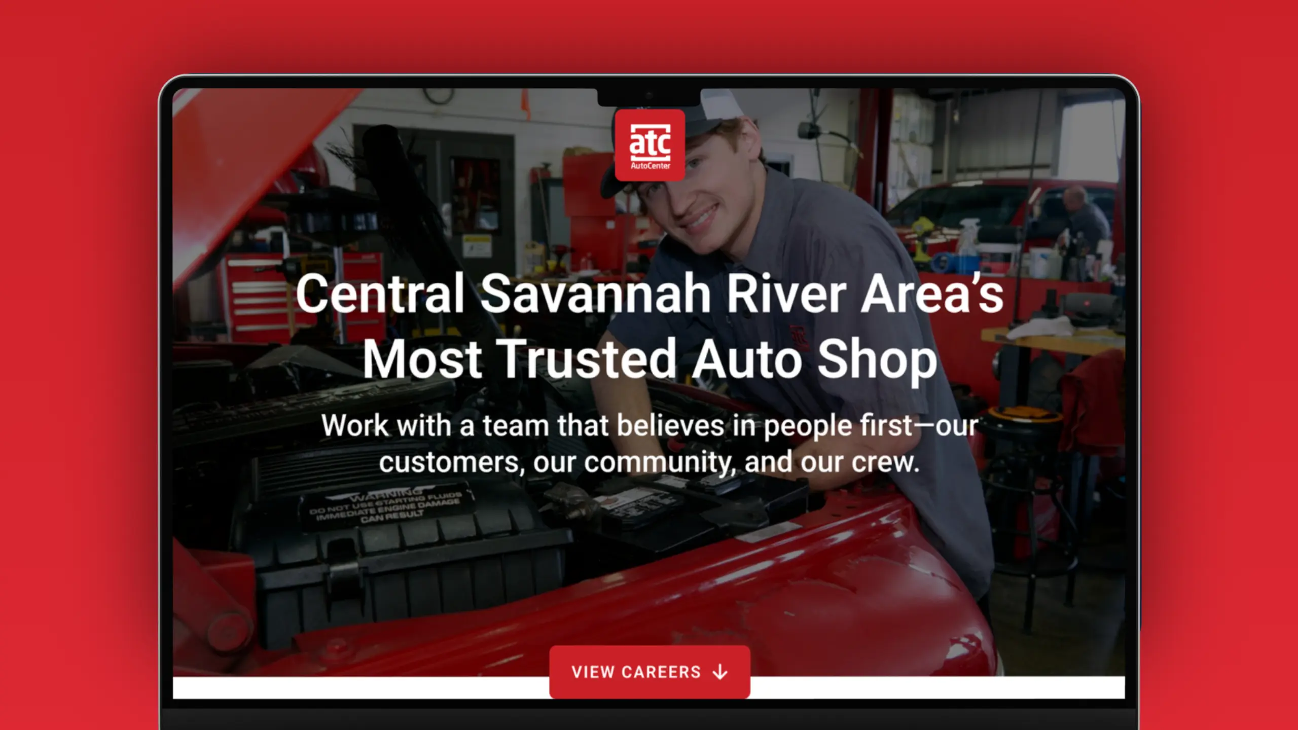
Hero Section Audit Questions
- Does the headline communicate value?
- Is the target audience clearly identified?
- Is there a visible primary CTA?
- Is supporting copy concise?
- Does imagery reinforce the message?
If the answer to any of these questions is no, start there.
Step 2: Evaluate Message Match
One of the most overlooked landing page optimization techniques is message consistency. Visitors arrive with expectations. Those expectations are created by:
- Google ads
- Social media ads
- Email campaigns
- Organic search results
- Referral links
If a user clicks an ad promoting a free website planning guide but lands on a generic services page, confusion immediately increases. Every landing page should continue the conversation that started before the click. Visitors should feel confident they arrived in the right place.
Step 3: Reduce Distractions
A landing page is not a homepage. This distinction is critical. Many SMBs create landing pages but continue treating them like traditional homepages. The result is too many competing actions.
Common distractions include:
- Full website navigation
- Multiple CTAs
- Excessive footer links
- Sidebar content
- Irrelevant resources
Every additional option introduces friction.
When evaluating a landing page CRO audit, ask yourself, “What is the one action I want visitors to take?”
Then eliminate elements that compete with that action. A focused landing page typically converts better because it reduces decision fatigue and keeps visitors moving toward a clear goal.
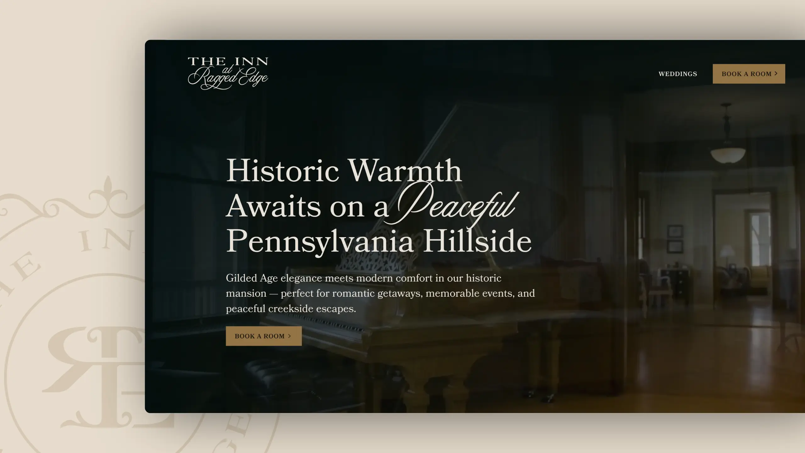
Step 4: Analyze CTA Placement
Calls-to-action can’t be treated as an afterthought, especially when it comes to placement. CTA placement can significantly impact landing page conversion rate optimization. A common mistake is requiring visitors to scroll extensively before encountering a CTA. Instead, CTAs should appear strategically throughout the page.
A practical structure might include:
- Above the fold: Primary CTA
- Mid-page: Secondary CTA following key benefits
- After social proof: CTA after testimonials or case studies
- Bottom of page: Final CTA before exit
The objective is to ensure users never have to search for the next step.
Step 5: Review Trust Signals
Most visitors arrive skeptical, so your landing page must earn trust before asking for action.
This is especially important for:
- Professional services
- Financial institutions
- Nonprofits
- SaaS companies
- Healthcare organizations
- Government recruitment campaigns
Strong trust signals include:
- Client testimonials
- Reviews
- Certifications
- Awards
- Industry partnerships
- Case studies
- Relevant statistics
For example, rather than saying, “Trusted by businesses nationwide,” a more specific testimonial might look like “Trusted by more than 150 organizations, including community banks, nonprofits, and local governments.”
Specificity creates credibility.
Step 6: Review Content Hierarchy
Landing pages commonly fail because they overwhelm visitors with information. A landing page should guide readers through a logical sequence:
- Problem: What challenge exists?
- Solution: How do you solve it?
- Benefits: Why should visitors care?
- Proof: Why should they trust you?
- Action: What should they do next?
When content jumps randomly between topics, users are forced to work harder to understand the offer. A well-structured page reduces cognitive load and increases conversion opportunities.
Step 7: Audit Forms for Friction
One of the fastest ways to improve landing page conversion optimization is simplifying forms. Many businesses ask for too much information too early.
For example, requesting the following before providing value often creates unnecessary friction:
- First Name
- Last Name
- Company
- Title
- Phone
- Industry
- Revenue
- Budget
- Timeline
Instead, ask only for information required to move the relationship forward. In many cases, fewer fields result in more conversions. The key is balancing lead quality with conversion volume.

Step 8: Review Mobile Experience
For many organizations, mobile visitors represent a significant percentage of overall traffic. Unfortunately, many landing pages are still designed primarily for desktop users.
Common issues include:
- Slow load times
- Difficult-to-complete forms
- Poor button placement
- Excessive scrolling
- Text that’s difficult to read
During any landing page audit checklist review, mobile experience should receive equal attention as desktop performance. A page that performs well on desktop but poorly on mobile leaves conversions on the table.
Step 9: Consider Industry-Specific Expectations
Not every landing page should look the same. Landing page optimization examples vary significantly by industry.
SaaS Landing Pages
SaaS landing page optimization trends often prioritize:
- Product demonstrations
- Interactive experiences
- Feature comparisons
- Free trial offers
- Customer success stories
Nonprofit Landing Pages
Nonprofits often benefit from:
- Mission-driven storytelling
- Donor impact statistics
- Strong emotional messaging
- Simple donation pathways
Financial Institutions
Banks and credit unions frequently require:
- Trust-building content
- Compliance considerations
- Community-focused messaging
- Clear explanations of services
Technical Service Providers
Industrial and technical organizations often perform better when emphasizing:
- Experience
- Certifications
- Safety records
- Proven results
- Project portfolios
Understanding audience expectations is critical to successful optimization.
A Repeatable Landing Page Audit Checklist
When conducting a landing page teardown, use this framework:
Messaging
- Clear headline
- Defined audience
- Strong value proposition
User Experience
- Easy navigation
- Logical content flow
- Mobile responsiveness
Conversion Elements
- Visible CTA
- Multiple conversion opportunities
- Reduced form friction
Trust
- Testimonials
- Case studies
- Social proof
Technical Performance
- Fast load speed
- Mobile optimization
- Functional forms
Focus
- One primary objective
- Limited distractions
- Consistent messaging
A landing page doesn’t need to be perfect to improve results; it simply needs to remove obstacles that prevent visitors from taking action.
Great Landing Pages Aren’t Accidents
The highest-performing landing pages are built through intentional strategy, testing, and continuous optimization. For small and medium-sized businesses, improving a landing page often delivers a greater return than increasing advertising budgets or launching new campaigns. Small improvements in messaging, user experience, trust, and conversion pathways can have a measurable impact on results.
At Cross & Crown, we help organizations create websites and landing pages that support business goals, improve user experience, and drive meaningful conversions—while also looking good. If you’re ready to uncover opportunities within your existing website, our team can help you evaluate, optimize, and strengthen your digital presence through a strategic landing page audit.

Cross & Crown
Based in Chambersburg, PA, we build & refine brands that inspire trust, drive engagement, lead with purpose, and ensure a thriving future.
Last Update: August 29, 2026
Read More
September 22, 2026
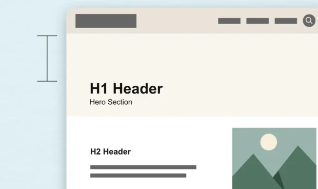
White Space Is One of the Most Powerful Design Tools
White space is more than empty space on a page. Learn how intentional spacing in web design improves readability, guides attention, and creates a better user experience.
Read Post
September 15, 2026
The Complete Guide to WCAG 2.2 for Website Owners
WCAG, the ADA, and other accessibility requirements often get discussed together, but they serve different purposes. Here's what website owners should know about accessibility standards, legal requirements, and creating a more usable website.
Read Post
September 1, 2026
A County Government’s Guide to Modern Public Communications
Public trust is built one interaction at a time. Discover how county governments can modernize their communications, improve the resident experience, and support long-term engagement with practical, people-first strategies.
Read Post