

Your board approves a redesign budget. Someone shares a school or church website they love. Six months and a lot of meetings later, the new site launches, the homepage looks great, and tour requests or first-time visitors look about the same as before.
That outcome is common. Website redesigns tend to go sideways in predictable places, and much of the damage happens before a single page is built. Below are the website redesign mistakes we see most often at Christian schools, churches, and ministries, grouped by when they tend to show up, with a way to fix each one.
Planning Missteps That Derail a Redesign Early
Most redesign problems start in the first few weeks, when goals, audience, and content get decided or skipped. The four below come up most often.
No One Can Say What the New Site Is For
Ask three people on your team what the redesign should accomplish, and you may hear three answers: a fresher look, more applications, and an easier way to give. Without a shared answer, design choices turn into debates about taste, and nobody can tell afterward whether the project worked.
How to fix it: Agree on two or three outcomes before design begins and put a number on each one, such as tour requests per month, online gifts, or first-time visitor sign-ups. Record today’s figures so you have something to compare against after launch.
The Redesign Follows Leadership’s Taste, Not Your Visitors’ Needs
It’s natural for decisions to reflect what the head of school, pastor, or board likes. The people who use the site most, your target audience, like a parent comparing schools or a family looking for a church, rarely get a say, even though they may become potential customers.
How to fix it: Talk to a handful of them early. Ask current and prospective families, new members, and donors from your ideal audience what they looked for on your site and where they got stuck. Bring those answers into design conversations when opinions differ, and use user needs as the standard.

The Budget Covers Design but Not Content
Design and development get a line in the budget. Writing, editing, photography, and moving old content over often don’t, so they get squeezed at the end. The launch date slips, or the site goes live with placeholder text and stock photos instead of showing real projects and real moments from ministry, school, or church life.
How to fix it: Set aside time and money for new copy, real photos of your students, staff, and congregation, and clear write-ups of your services or core offerings where relevant. Decide who writes what, and by when, before the design is finished so the site reflects your business with more credibility.
Every Old Page Gets Carried Over
A redesign feels like the perfect moment to move everything onto a new template. That includes the 2019 event page, three versions of the same form, and a staff list nobody has touched in years.
How to fix it: List every page and mark each one to keep, update, merge, or remove. A smaller site with current content is easier for visitors to navigate and easier for your team to maintain.
Where Redesigns Go Wrong During the Build
During design and development, problems usually come from choices made without real visitors in mind. Most of them are easy to prevent if you catch them early.
Copying a Site Built for a Different Target Audience
Showing your design team a school or church site you admire is helpful. Copying its layout is risky, since that site was built for a different audience with different content and priorities that may not fit your own brand or audience needs.
How to fix it: Use examples to describe what you like about them, such as the tone, the photography, or the simplicity, and treat strong website design as inspiration rather than a template. Then create your site around your own audience and what you want visitors to do.
Creative Menus Hide Tuition, Service Times, and Other Key Pages
Creative navigation, vague labels, and a homepage built around a full-screen video can look polished while making tuition, service times, or the application hard to find. Vague navigation and weak calls to action can also confuse visitors and lower conversions and sales.
How to fix it: Keep the main menu short and plain, with clear labels like Apply, Visit, About, and Give. Put the things visitors look for most within one click of the homepage. Each page should have one primary CTA and at most two secondary CTA buttons, with a clear call that guides visitors toward specific actions instead of vague prompts like “Learn more,” helping them move to other pages. Test the layout with someone who has never seen your site.
Mobile, Accessibility, User Experience, and Speed Wait Until the End
These three often get checked in the final week, when fixing them means redoing work. By then, the layout may have oversized images, small low-contrast text, and menus designed on a desktop screen, even though mobile users account for over 50% of website traffic, so delaying that review is costly. Responsive web design should adapt cleanly across screen sizes on phones, tablets, and desktops.
How to fix it: Start with a mobile design built for mobile devices and tested across different devices, especially on smaller screens. Set text size and color contrast standards at the start, with font sizes of at least 16px for readability. Compress images, video, and other media files as they’re added to avoid slow load times; pages that take more than 3 seconds to load cause over half of visitors to leave. Review progress on a real phone at every stage to catch usability issues early, and run a free checker like WAVE or Lighthouse along the way.
Questions Schools and Ministries Ask Before a Redesign
How Do I Know if My School or Ministry Website Needs a Redesign?
Look for patterns on poorly designed sites that frustrate visitors, including:
- Visitors can’t find tuition, service times, or giving information.
- The site is hard to use on a phone.
- Your team can’t make updates without a developer.
- The content no longer reflects who you are.
In fact, 33% of consumers leave websites due to bad UX. And 93% of visitors will leave a poorly designed website. Sometimes clearer navigation and fresh content solve these web design mistakes without a full redesign, so start by finding out what frustrates your visitors.
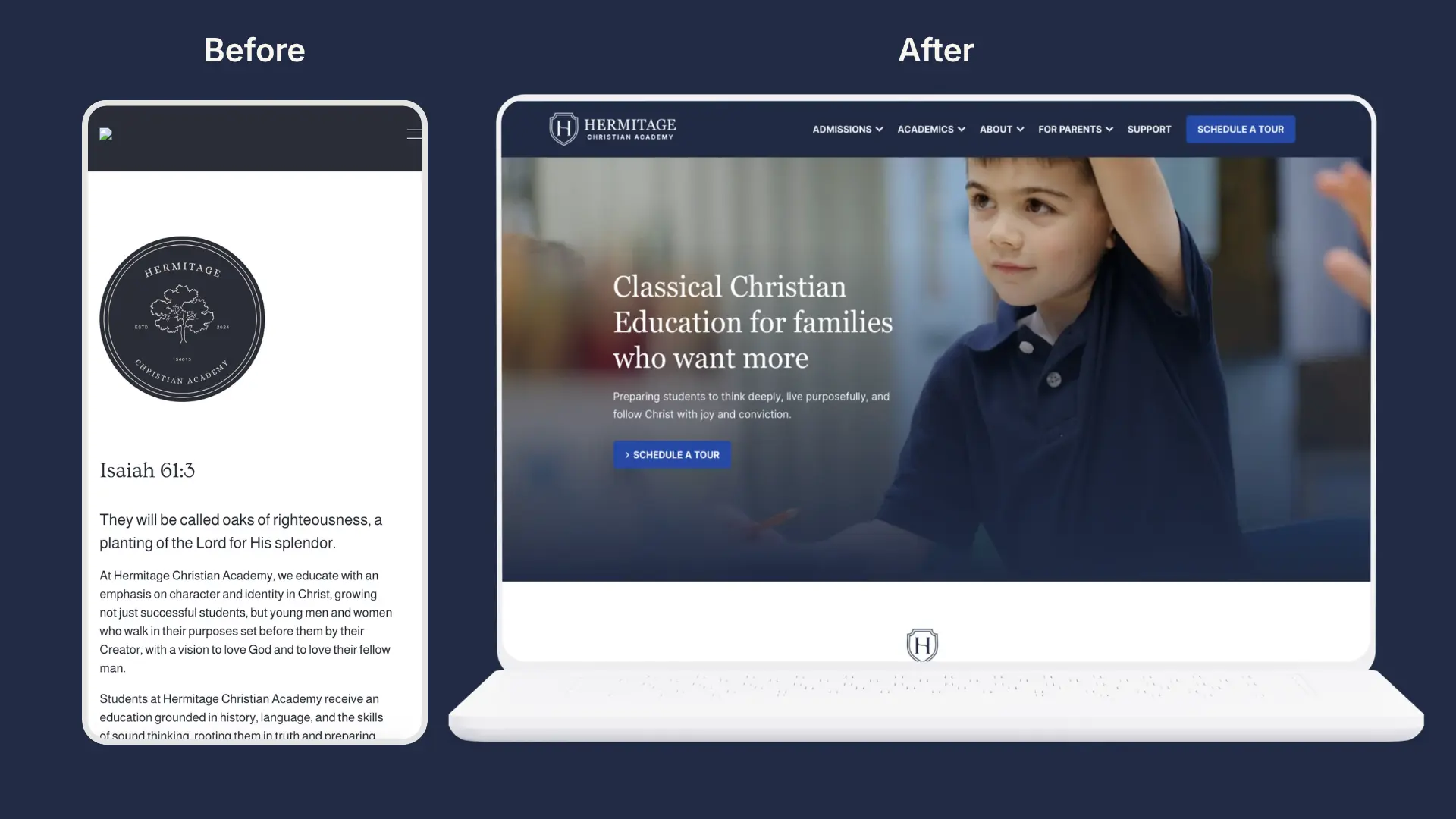
What Should We Do Before Starting a Website Redesign?
Agree on two or three measurable goals that will help the site guide visitors, record your current numbers, and talk to the families, members, and donors who use your site. Before the redesign starts, review your own website on a phone to spot usability issues. Then list every page, prioritize important content first, decide what to keep, update, merge, or remove, and plan who will write the new content and gather real photos.
Will a Redesign Hurt Our Search Rankings?
It can, if page addresses change without redirects or useful pages get removed carelessly, which can hurt SEO rankings. Neglecting local SEO can also keep potential customers from finding the organization on Google. Match every old address to the most relevant new page before launch, and check Google Search Console afterward for errors.
Who Should Manage the Website After Launch?
Name one person to coordinate the site and an owner for each key area, such as admissions, events, staff, and giving. Choose a content management system those people can use comfortably, and schedule check-ins at 30 and 90 days after launch.
What Should We Test Before Launching a New Website?
Submit every form on a phone and a computer, since 61% of consumers prefer mobile-friendly websites; make a test gift, confirm that confirmation emails arrive, and click through your redirects. Ask someone who has never seen the site to find tuition or service times, and run a free accessibility checker like WAVE or Lighthouse to verify basics like alt text; accessible design benefits all users, not just those with disabilities, and approximately 1 billion people live with disabilities worldwide. Mobile users expect websites to load in under 5 seconds.
Let’s Build a Better Website Together
A redesign goes better when the thinking comes before the visuals: clear outcomes, input from the people who use your site, content that’s ready, and design choices that avoid too many colors so the site does not confuse users. If you only tackle one thing, write down what the new site needs to accomplish and record your current numbers. Everything else gets easier from there.
At Cross & Crown, we design and build websites for Christian schools and ministries, and we work through strategy, content, calls to action, and SEO with you before the first mockup. If a redesign is on your horizon, we’d love to talk it through. Contact Cross & Crown to start the conversation.

Cross & Crown
Based in Chambersburg, PA, we build & refine brands that inspire trust, drive engagement, lead with purpose, and ensure a thriving future.
Last Update: November 9, 2026
Read More
October 26, 2026
How Much Should a Nonprofit Website Cost in 2026?
Five agencies can give you five very different website quotes. Learn what goes into nonprofit website cost in 2026, from strategy and design to development, content, and ongoing support.
Read Post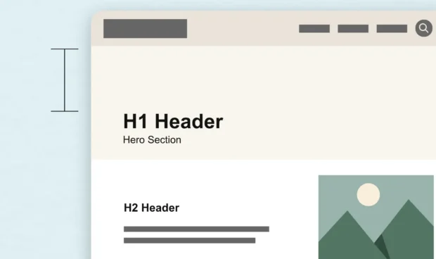
September 22, 2026
White Space Is One of the Most Powerful Design Tools
White space is more than empty space on a page. Learn how intentional spacing in web design improves readability, guides attention, and creates a better user experience.
Read Post