
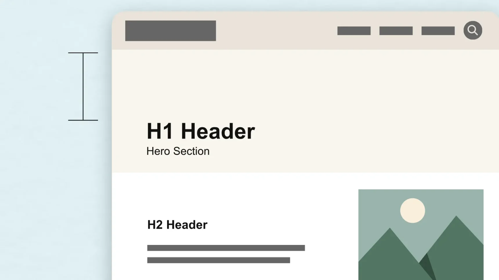
A website can contain all the right information and still leave visitors feeling lost. A homepage crowded with banners, announcements, images, and competing calls to action can make it difficult for people to know where to look or what step to take next. Adding more content does not always make a website more helpful. When every element competes for attention, important messages can get buried. Visitors need structure, hierarchy, and room to process what they see.
That room is created through white space in design. Also known as negative space, white space is the intentional space between elements that helps guide attention, improve readability, and create a smoother user experience. It gives content the space it needs to make an impact.
For organizations building a website, white space plays an important role in how people experience a brand online. Thoughtful spacing can make information easier to understand, create a more intuitive path through a page, and help visitors focus on what you need them to.
At Cross & Crown, we approach design as a communication tool. Every element on a page should serve a purpose, including the space between those elements.
What Is White Space in Design?
White space refers to the empty areas around and between design elements. This includes the space between paragraphs, margins around content blocks, gaps between navigation links, padding inside buttons, and the space surrounding images or calls to action.
Despite the name, white space does not need to be white. It can be any color, texture, or background treatment as long as the area gives content room to breathe without competing for attention.
For example, a church website with a simple headline, a welcoming image, and a “Plan Your Visit” button placed over an open background is using white space intentionally. The space around those elements helps visitors immediately understand the page’s focus.
Designers typically think about white space in four ways.
Micro White Space
Micro white space refers to smaller spaces within individual design elements, including:
- Letter spacing
- Line spacing
- Space between words
- Padding inside buttons
- Gaps between navigation items
- Spacing between form fields
These small adjustments affect readability and usability. When text and interactive elements are too tightly packed, a page can feel difficult to navigate.
Macro White Space
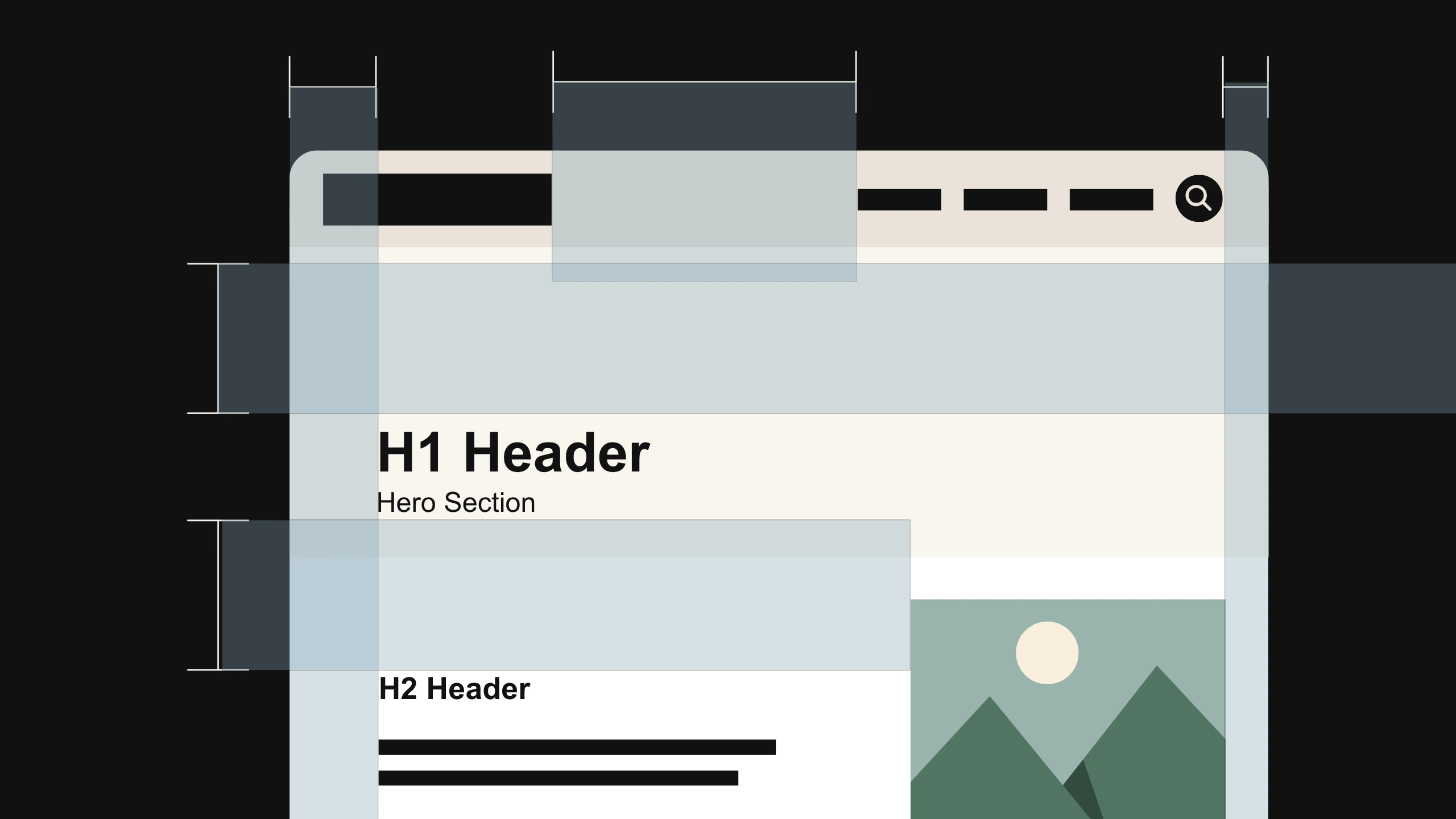
Macro white space refers to larger areas between major sections of a page, such as
- Space between a hero section and the content below
- Margins around text blocks
- Gaps between feature sections
- Space surrounding images or graphics
Macro white space creates structure and helps visitors understand how different pieces of content relate to each other.
Active White Space
Active white space is intentionally created to draw attention to something important. A designer may add extra space around a headline, image, or call-to-action button to make it stand out.
Passive White Space
Passive white space happens naturally through standard design choices, such as line height, margins, and grid systems. While it may not always be noticeable, it plays an important role in keeping layouts organized and comfortable to use.
Effective websites use all four types of white space together. The goal is to create balance and make the experience feel intentional.
Why White Space Is Essential for Website Design
The way a website uses space affects how easily visitors can absorb information, find what they need, and move through the page.
Creates Visual Hierarchy
Visitors do not read every website from top to bottom. They scan, looking for information that helps them decide where to go next. White space helps establish a clear order of importance. Elements with more space around them naturally receive more attention, while grouped elements feel connected.
A headline with generous spacing around it feels more important than one surrounded by competing content. Similarly, a call-to-action button separated from surrounding elements feels easier to identify, and a well-spaced section helps visitors understand where one idea ends and another begins.
This is why many minimalist designs feel intentional rather than empty. Brands like Apple use white space to keep attention focused on a single product, message, or action.
Improves Readability
A page filled with large blocks of text can feel difficult to approach, even when the content itself is valuable. White space creates breathing room between ideas. Spacing between paragraphs, headings, and sections makes information easier to scan and helps visitors find the answers they need.
This matters especially for websites that need to communicate complex information. A nonprofit explaining a giving initiative, a healthcare organization sharing resources, or a business describing its services all benefit from content that feels approachable.
Good design gives readers a clear path through information instead of asking them to work through a wall of text.
Supports Better User Experience
User experience is shaped by every interaction someone has with a website. Visitors should be able to understand where they are, what information is available, and what steps they can take next.
Crowded layouts create friction. When navigation links, images, text, and buttons compete for attention, users have to spend more effort figuring out the page.
Strategic white space reduces that friction by creating separation and clarity. It helps users recognize patterns, understand relationships between elements, and move through a website more naturally.
Does More White Space Increase Conversions?
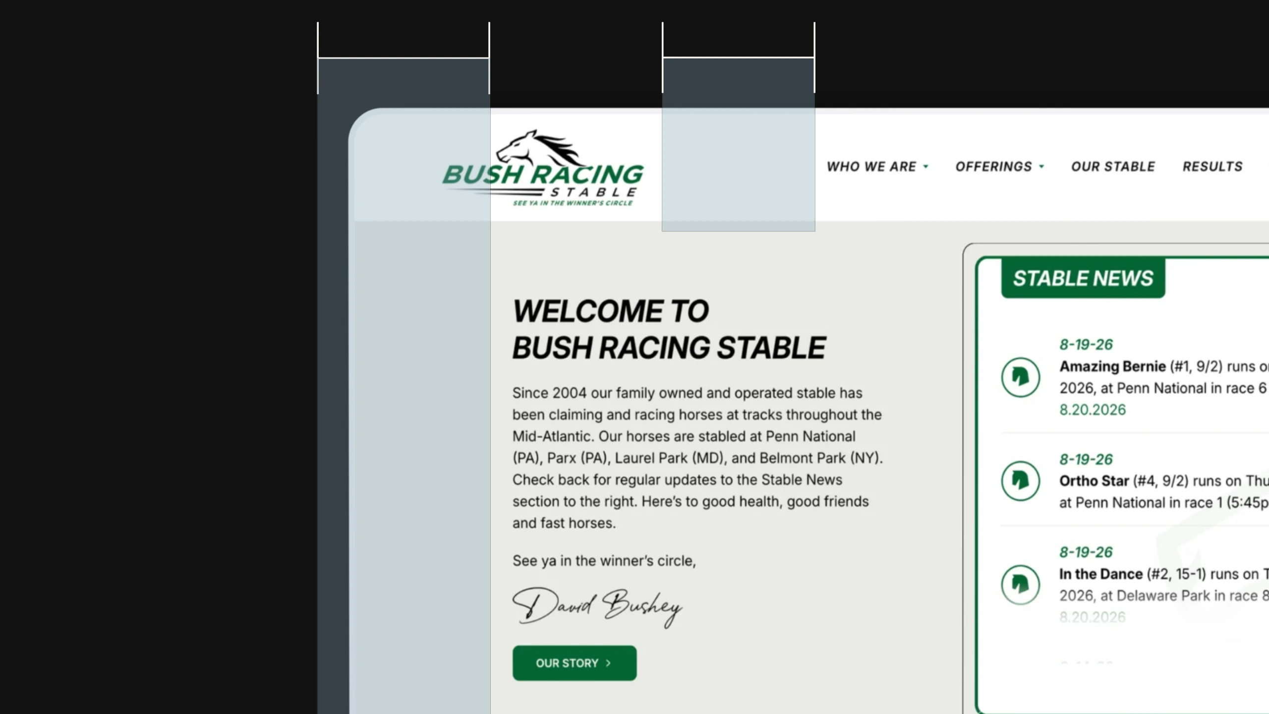
White space can support stronger website performance, but the relationship is more nuanced than simply adding more empty space to a page. Visitors are more likely to engage with a website when they can quickly understand the message, identify important information, and recognize their next step. White space supports that process by creating focus and reducing distractions.
Let’s consider a donation page. A “Give Now” button surrounded by intentional space feels easier to find than one competing with multiple banners, announcements, and unrelated links.
The same principle applies to service pages. A visitor deciding whether to contact a company needs a clear understanding of the offering, the value it provides, and the action they should take next. Thoughtful spacing helps those pieces work together.
Overall, white space alone does not create conversions. Strong messaging, clear calls to action, intuitive navigation, and trust-building elements all contribute to a successful website experience. Design creates the environment where those elements can guide visitors forward.
White Space Is Also a Content Strategy Tool
White space is often discussed as a visual design principle, but it also applies to the way content is written and organized. A webpage with thoughtful content spacing is easier to read and navigate.
This includes:
- Shorter paragraphs
- Descriptive headings
- Bulleted information when appropriate
- Clear sections
- Space between ideas
This approach also supports SEO. Search engines prioritize content that provides a good experience for users, and organized pages make it easier for visitors to find relevant information.
Design and content work best when they support each other. Strong copy needs thoughtful presentation, and thoughtful design needs meaningful content.
4 Common White Space Mistakes Businesses Make
1. Trying to Include Everything on the Homepage
Organizations often want their homepage to answer every possible question. The result can be a crowded page where important messages compete for attention.
A strong homepage prioritizes the information visitors need most and creates clear paths to additional resources.
2. Assuming More Content Creates More Value
Additional content only helps when it serves a purpose. Filling every available space with icons, announcements, or extra sections can make a website feel overwhelming. Removing unnecessary elements often creates a clearer experience.
3. Using the Same Layout for Every Page
Different pages serve different purposes. A homepage, service page, landing page, and blog article each need different layouts and spacing decisions.
A page designed to encourage action may need more focused white space around key elements, whereas a resource page may require a different structure to support browsing and reading.
4. Forgetting About Mobile Design
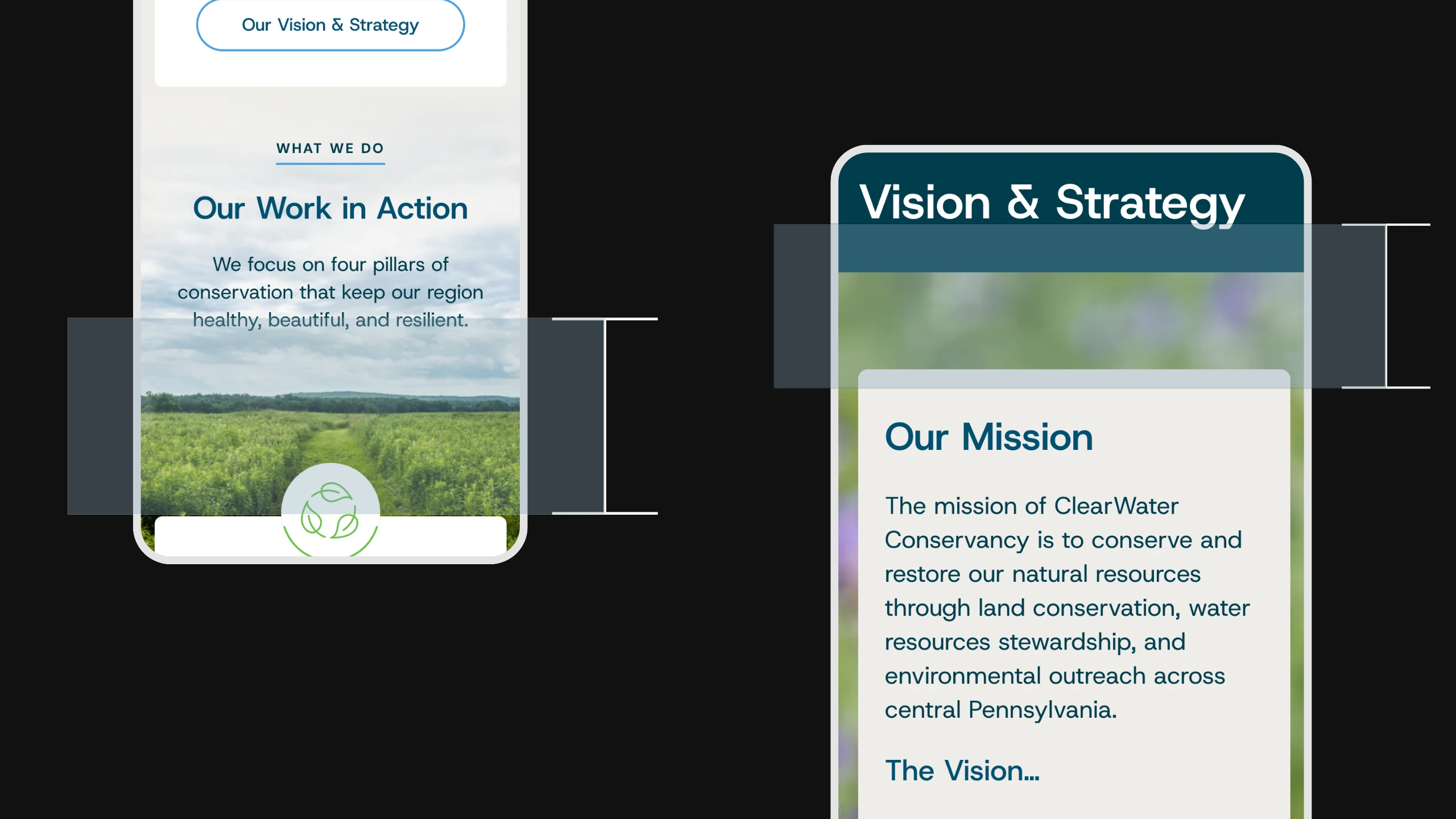
White space that works well on desktop can become cramped on smaller screens if it is not considered during the design process. Mobile users need enough space to read comfortably and interact with buttons, links, and forms easily.
How to Improve White Space on Your Website
Improving white space does not always require a complete redesign. Small changes can create a noticeable difference:
- Break long sections of text into smaller sections
- Add space around important calls to action
- Simplify crowded navigation menus
- Remove elements that compete for attention
- Use consistent spacing throughout the website
- Review mobile layouts for cramped areas
- Give headlines and key messages room to stand out
Remember, the goal is to create intentional experiences.
Good Design Gives People Room to Understand
White space gives websites clarity, helping organize information, guide attention, and create experiences that feel easier to navigate.
The strongest designs understand that every element on a page matters, including the space between those elements. When a website has room to breathe, visitors can focus on the message, understand their options, and take the next step with confidence.
If your website feels crowded, difficult to navigate, or unclear, Cross & Crown can help. Our team creates strategic digital experiences that bring together thoughtful design, clear messaging, and user-focused strategy to help organizations better connect with their audiences.
Contact Cross & Crown to start a conversation about how your website can better serve the people you want to reach.

Cross & Crown
Based in Chambersburg, PA, we build & refine brands that inspire trust, drive engagement, lead with purpose, and ensure a thriving future.
Last Update: August 30, 2026
Read More

October 12, 2026
The State of Marketing in the Age of AI
AI is changing how marketers work, from content creation and automation to personalization and campaign strategy. Here’s what we’re seeing, what we think is worth paying attention to, and why human strategy and creativity will continue to matter.
Read Post
October 5, 2026
How to Market a Church Without Compromising Your Mission
Church marketing can feel at odds with a church’s mission, but thoughtful communication can help more people find and connect with the ministry already happening in their community. Here’s how to market a church with clarity, authenticity, and a focus on serving people well.
Read Post
September 15, 2026
The Complete Guide to WCAG 2.2 for Website Owners
WCAG, the ADA, and other accessibility requirements often get discussed together, but they serve different purposes. Here's what website owners should know about accessibility standards, legal requirements, and creating a more usable website.
Read Post