

Picture someone trying to donate to a nonprofit they care about. They land on the page, but the “Give Now” button blends into the background colors so thoroughly they can barely read it. They try to tab through the form with a keyboard and get stuck—trapped in a date picker that won’t release focus. A video explaining the organization’s mission plays automatically with no captions. They leave.
That person might be using a screen reader because they’re blind, or navigating by keyboard because of a motor disability, or simply reading on a phone in bright sunlight. Web accessibility is about designing websites so individuals with various disabilities—and everyone else—can actually use them. Approximately 16% of the global population experiences significant disability, and accessibility features can benefit all users, not just those with disabilities.
WCAG 2.2, the current version of the web content accessibility guidelines, provides testable success criteria that help organizations reduce accessibility barriers across web pages, web apps, and digital services.
What Is WCAG 2.2?
WCAG stands for Web Content Accessibility Guidelines. Before WCAG existed, over 38 different web access guidelines were developed by various organizations—which made consistency difficult. The World Wide Web Consortium (W3C), through its accessibility guidelines working group, unified these efforts into WCAG, a single set of international rules explaining how to make web content accessible to people with disabilities, covering non-text content, video, forms, data tables, and interactive tools.
WCAG is a technical standard recognized worldwide. It is not itself a law, but many accessibility requirements in the U.S., Canada, and Europe reference it directly.
The WCAG guidelines are based on four principles—perceivable, operable, understandable, and robust—known by the acronym POUR:
- Perceivable: Users can see or hear the content. This covers text alternatives for images, captions for video, proper color contrast, and handling of flashing content.
- Operable: Users can interact with controls, menus, and navigation. This includes keyboard access, time limit adjustments, and avoiding keyboard traps.
- Understandable: Content and user interface behavior are clear—predictable navigation, readable language, and helpful error messages.
- Robust: Content works with different browsers (user agents), assistive technology, mobile devices, and other devices.
WCAG 2.1 includes 13 guidelines organized under these four principles. Each guideline contains specific, testable success criteria grouped into three levels of conformance: Level A (basic), Level AA (the widely adopted standard for most public-facing sites), and Level AAA (enhanced, not always realistic for an entire site). Most organizations aim for Level AA success criteria as their practical target.
WCAG 2.0, 2.1, and 2.2: How They Relate and What Changed
WCAG 2.1 and WCAG 2.2 build on previous versions rather than replacing them. Each version adds new success criteria while keeping the existing requirements largely intact, making the standards backwards compatible. In other words, content that conforms to WCAG 2.2 also conforms to WCAG 2.1 and WCAG 2.0.
Published in 2018, WCAG 2.1 added 17 success criteria focused on improving accessibility for people with mobile accessibility needs, low vision, and cognitive and learning disabilities.
WCAG 2.2, published in 2023, added nine additional success criteria, with new guidance addressing areas such as focus visibility, target size, dragging movements, consistent help, redundant data entry, and accessible authentication. It also made one change to the earlier standards by removing Success Criterion 4.1.1, Parsing, which W3C now considers obsolete.
For website owners, the practical takeaway is fairly straightforward: WCAG 2.2 represents the current version to work toward while still building on the accessibility requirements introduced in WCAG 2.0 and 2.1. W3C recommends using WCAG 2.2 as the current conformance target, even when an existing policy references an earlier version.
Where Accessibility Problems Usually Show Up on a Website
People with disabilities use assistive technology every day to complete tasks most of us take for granted: applying for jobs, donating to causes, accessing state and local government services, paying bills. When web accessibility barriers block those tasks, inaccessible websites deny equal access to information for people with disabilities. Web accessibility barriers can prevent access to essential services.
You don’t need to read the full WCAG specification to spot potential accessibility problems. Here are the most common areas where barriers appear.
Images and alt text
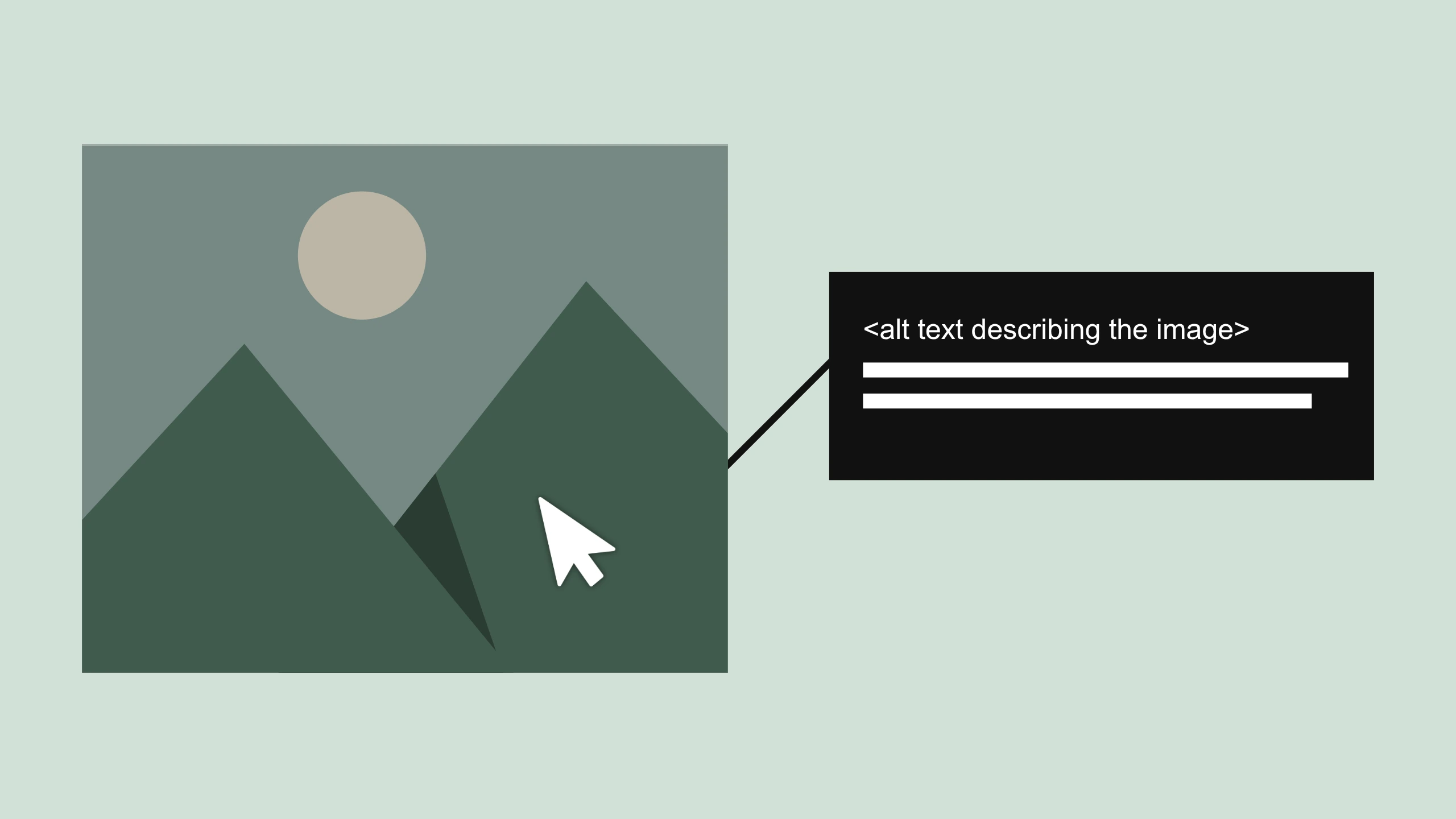
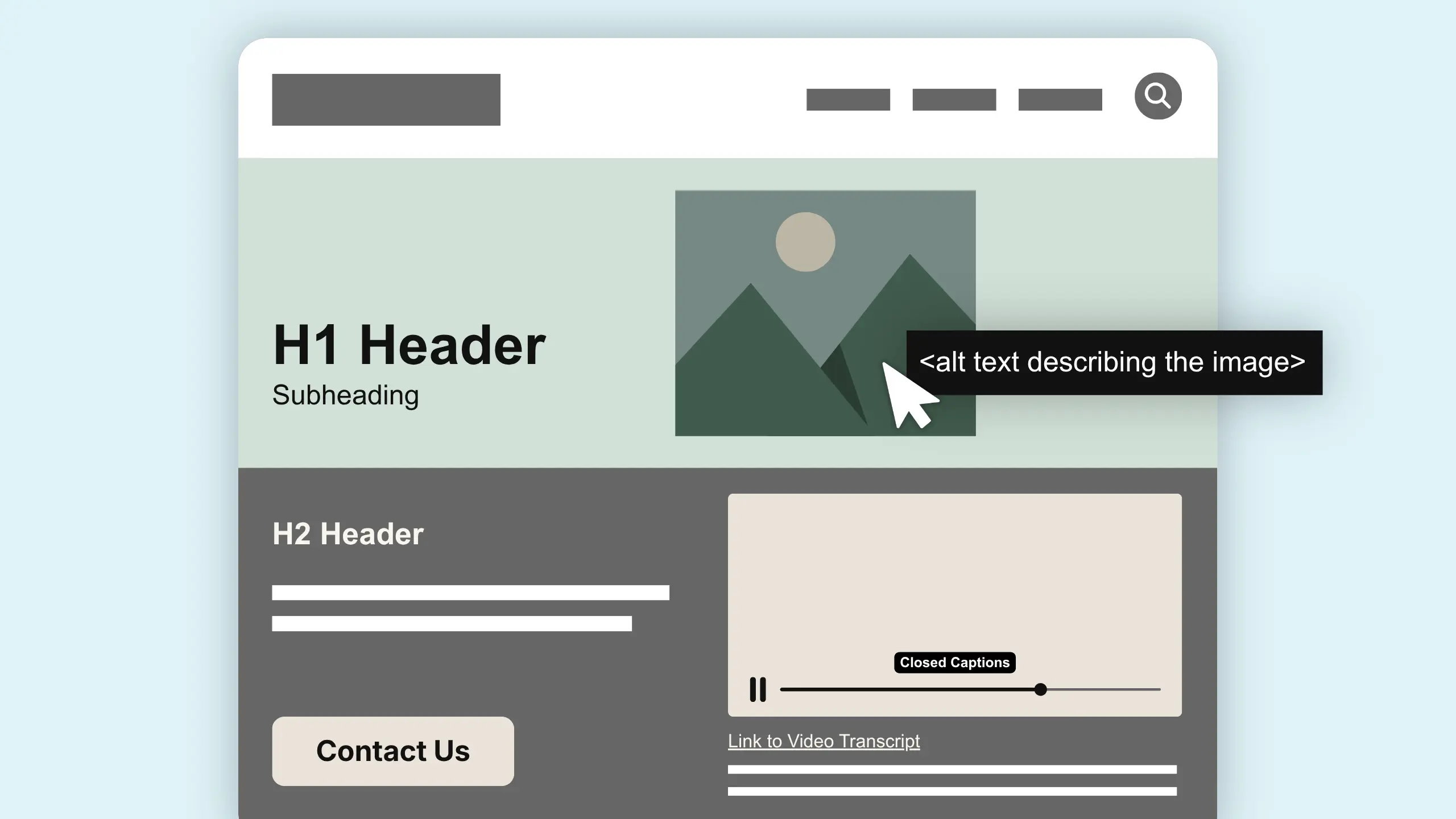
Every non-text element should have an accessible alternative, such as meaningful alt text for images. Lack of alt text on images excludes blind users from content entirely. Avoid vague labels like “image123” or keyword-stuffed descriptions. For purely decorative images, use an empty alt attribute so screen readers skip them.
Color, background colors, and contrast
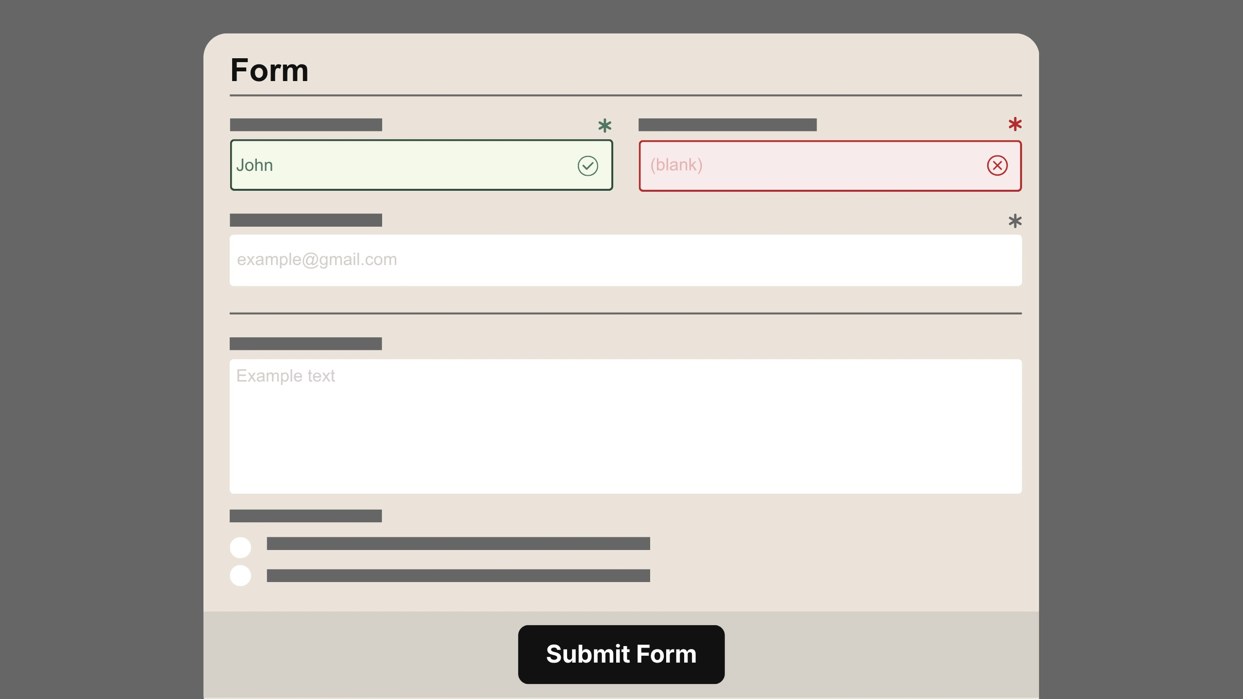
Poor color contrast affects users with limited vision. A minimum color contrast ratio of 4.5:1 is recommended for normal text. Color alone cannot convey information for color—if an error message only appears in red with no text label, some visitors will miss it entirely.
Keyboard navigation and keyboard traps
People with disabilities use screen readers to navigate inaccessible websites, and many assistive technology users navigate with a keyboard only. All interactive elements should be fully accessible using only a keyboard. A keyboard trap—getting stuck in a user interface component like a modal or embedded media player—is one of the most frustrating barriers. Try tabbing through your own site to see if focus is visible and movement makes sense.
Headings and page structure
Using a clear heading hierarchy (H1, H2, H3) helps screen reader users navigate and jump around a page. It also helps all visitors scan long web pages.
Forms and input assistance
Forms should have associated labels to enhance accessibility. Login, donation, checkout, and contact forms all need clear instructions and meaningful error messages. WCAG 2.2’s redundant entry criterion and accessible authentication requirements reduce repetitive input and memory-based tests in form fields.
Links, buttons, and target size
Generic link text like “click here” or “read more” makes no sense out of context for someone using a screen reader. WCAG 2.2’s target size (minimum) criterion ensures each user interface component, like buttons and icons, is large enough to tap reliably. Aim for clear, action-oriented labels.
Video, audio, and media alternatives
Videos without captions limit access for hearing-impaired users. Provide captions for all video content, transcripts for audio, and audio descriptions for key visual-only or video-only information. A media alternative helps not just people who are deaf or blind but also users in quiet or noisy environments.
Fonts and readability
Pay attention to font size, line spacing, and line length. Small text, tight spacing, and very long lines reduce readability for everyone. These design elements connect directly to WCAG’s perceivability focus.
How Accessibility Connects to UX, SEO, and Conversions
Accessibility, UX, SEO, and conversion strategy are not separate silos. Improving accessibility often fixes pain points already causing drop-offs in leads, registrations, or donations.
A clear call-to-action button with good contrast and descriptive text helps someone using assistive technology and increases clicks for everyone. Well-structured headings help screen reader users navigate and also improve how all visitors scan content, boosting time on page. Accessible forms with clear labels and no confusing keyboard trap behaviors reduce abandonment on high-value tasks like checkout or volunteer sign-ups.
Descriptive alt text, meaningful link text, and consistent navigation support both assistive technology users and search engines by clarifying what each page and action is about—indirectly supporting better SEO and click-through behavior.
At Cross & Crown, we approach web design and digital marketing as a connected whole: discovery, UX planning, content strategy, accessible design systems, development, and testing that consider accessibility from the earliest stages.
WCAG, ADA, and Other Accessibility Requirements: How They Fit Together
WCAG 2.2 provides a technical framework for making websites and digital content more accessible. Laws and regulations, including the Americans with Disabilities Act (ADA), Section 508, and various state and international requirements, establish legal obligations for certain organizations. The two are closely connected, but they aren’t the same thing.
WCAG is often used as a practical benchmark when organizations evaluate website accessibility. Many laws and regulations reference WCAG or incorporate parts of its guidelines, but the specific requirements can vary depending on the organization, location, and type of website or digital service.
For example, federal agencies follow accessibility requirements under Section 508, while state and local governments are subject to additional requirements under Title II of the ADA. Other states and countries have their own accessibility regulations.
For website owners, the takeaway is that WCAG provides a strong foundation for accessibility, but meeting WCAG alone doesn’t necessarily guarantee legal compliance. Organizations should understand which requirements apply to them and seek legal guidance when they need help interpreting specific obligations.
Can an Inaccessible Website Lead to a Lawsuit?
Yes. Numerous organizations—retailers, restaurants, universities, churches, and local governments—have faced complaints or lawsuits when their websites created accessibility barriers. In 2025 alone, plaintiffs filed over 3,100 federal ADA website accessibility lawsuits, a 27% increase over 2024.
Legal risk is one important reason to take accessibility seriously. But the deeper motivation should be serving people well and living up to your organization’s values. Paying attention to accessibility early is almost always less expensive than responding to complaints or retrofitting under tight deadlines.
How to Start Improving Your Website’s Accessibility
You don’t need to memorize every WCAG success criterion to take meaningful action. Here’s a practical path:
- Start with an accessibility audit of key user journeys—homepage, main service pages, online forms, donation or checkout, and login. Use a combination of automated tools and human review. Automated checkers catch issues like missing alt attributes and low contrast but typically detect only a portion of accessibility barriers.
- Look for patterns. If many pages share the same missing labeled forms, low contrast, or inconsistent heading levels, fix the design system or template rather than each page individually.
- Prioritize what blocks essential tasks. A keyboard trap in a checkout form or lack of captions on training videos matters more than fine-tuning AAA-level focus appearance.
- Test with real assistive technology. Testing with real users and assistive technologies is essential for accessibility quality assurance. Try navigating your site with a screen reader or keyboard only. If feasible, involve people with disabilities in usability testing.
- Build accessibility into ongoing workflows. Add alt text to every new image, check contrast when changing background colors, write descriptive link text, and consider accessibility whenever new features launch.
- Work with a knowledgeable partner. Cross & Crown can help identify accessibility concerns and incorporate accessibility into website design, development, UX, SEO, performance, and ongoing support—so improvements work together rather than becoming another item on the checklist.
Accessibility Is Part of Taking Care of Your Website
A website continues to change long after launch. Content gets updated, technology evolves, and the people using it bring different needs and expectations. Building accessibility into that ongoing work helps create a website that’s easier to use, easier to understand, and more welcoming to everyone.
If you’re unsure where your website stands, Cross & Crown can help identify accessibility concerns and prioritize improvements alongside UX, SEO, performance, and conversion goals. Reach out to our web team to start a conversation about making your website more accessible and effective.

Cross & Crown
Based in Chambersburg, PA, we build & refine brands that inspire trust, drive engagement, lead with purpose, and ensure a thriving future.
Last Update: August 31, 2026
Read More
September 22, 2026
White Space Is One of the Most Powerful Design Tools
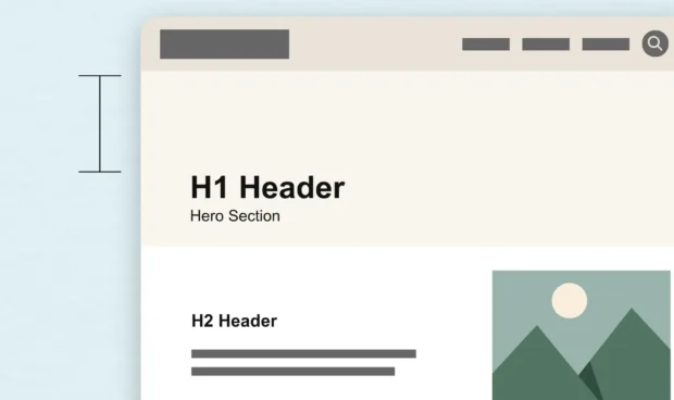
White space is more than empty space on a page. Learn how intentional spacing in web design improves readability, guides attention, and creates a better user experience.
Read Post
September 1, 2026
A County Government’s Guide to Modern Public Communications
Public trust is built one interaction at a time. Discover how county governments can modernize their communications, improve the resident experience, and support long-term engagement with practical, people-first strategies.
Read Post
August 24, 2026
Why Your Website Isn’t Generating Leads (And What to Fix First)
If your website gets traffic but few inquiries, it's time to look beyond the numbers. Explore the common reasons websites fail to generate leads and the practical improvements that can make a difference.
Read Post